LOGO CONCEPT FEEDBACK PLEASE - What do you think looks best?

in #branding4 years ago (edited)


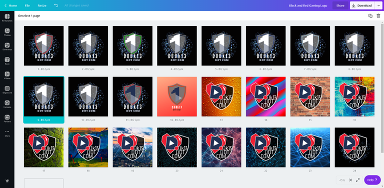
So I am playing today with my logo, web page and personal.

Using Canva to create concepts so fancy effects are kinda limited ... anyways I would really like any feedback on what looks best on the basic kind of concept ideas basis ... ideas I could try for round 2 ... please anything ... still filling out a few of the dark "1" designs but basically keeping to that background and choosing highlight colors for the badge.

I should be able to take the badge easily and remove the background around it if need be leaving the see through effect on badge to then place where ever on images or make it a favicon/icon.

I plan to take the final concept placing center in circle with transparent/white background so the standing background image is merely a highlight for image in front used as main logo... again background bleed through for badge can be left adding a neat texture and highlighting logo for use as a favicon/icon for both the personal and webpage logos.

I put out an APB for help on FB paying crypto 😅

I didn't mention I am planning on paying in SMOKE ... anyone notice the weekly buying as of late?


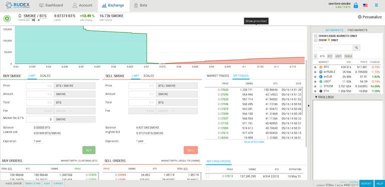
Now supporting the .07013 BTS/SMOKE level 😁 Thank you to whom ever is playing the run up...


Are you buying SMOKE?

Let me know in the comments below!!!

#rudex #branding #d00k13dotcom #smokenetwork

Has The Idea Of Being A Witness Crossed Your Mind? For me it started as a desire to learn if I could do it.

Maybe It's Time To Run That Idea Out? I for one will be certain to support in any way I can the new witnesses in their efforts to help maintain the blockchain... hit us up in discord ?

Join The Smoke.io Discord Here


This post's formatting is best viewed at https://d00k13.com/2020/05/logo-concept-feedback-please-what-do-you-think-looks-best/ : Posted with SteemPress via d00k13.com
Sort:  

For me a few things come to mind

  1. What is the website product ??
  2. Does the Log reflect the website Product

When creating a logo you do not want the bacckgroun being busy.
What is the main colours of your site and perhaps the log should be produced with that colour as a background

A back ground that is busy will detract from the logo unless the background is representative.

I cannot make the image you have posted any bigger so cannot make out what the text is within the logo

This is a consideration as well, if there is text as part of the logo then it needs to be clear and concise, easily read at logo size.

Out of the ones in the image above the bottom row, 2nd from right - provided the background of this can be merged seamlessly into your website background otherwise it just looks like a square which in my opinion is a bit clunky

man I failed to communicate my idea clearly 😅

Example:
felbpx.jpg
Background is intended to be blurred into badge background, I like blending 😅

acv5hp.jpg

End result with gradient circular background, essentially this will be a round logo using some gradient to highlight the badge... was just asking about the first step of the badge 🤔 maybe I should upload a few badge ideas without the distracting background 😉

So to answer the questions.

  • product: my message of earning for creativity for therapy and some merch it I can figure that part out
  • logo reflect product: one love, the “1” in my logo is a new concept for onelovedtube/oneloveIPFS which has versions with or without the heart shooting for something platform universal. I think it does as the community message is my message, we will get there together.
  • website colours: I am building my logo out on DTube brand colours with a background colour set for highlights. I intend to choose from logo for my webpage so the focus is mainly on the clarify and feel of the logo.

https://canva.me/hWCzCL80z6

Thanks for your feed back, does the link above help you get the idea? New to this Canva thing.. can you see the whole group of 20 or just one image?